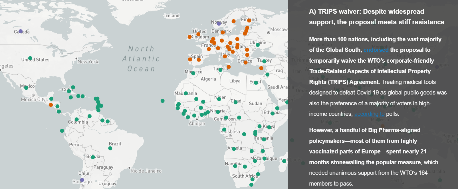
Global Covid-19 Vaccine Apartheid Storymap
This map depicts unequal access to Covid-19 vaccines around the world, highlights whether governments supported or opposed an initiative to temporarily suspend intellectual property restrictions to boost the supply of lifesaving doses, shows where untapped vaccine production potential exists, and explores efforts to expand generic manufacturing.
It was generated using the Mapbox Storytelling template, with GeoJSON files containing information about national vaccination rates (Our World in Data), governments' positions on the TRIPS waiver proposal at the WTO (Doctors Without Borders), the locations of idle mRNA manufacturing capacity (Doctors Without Borders and the Access IBSA project), and participants in the WHO-led mRNA vaccine technology transfer hub (Medicines Patent Pool).
*Awarded first place in the annual student dynamic map competition at the 2022 North American Cartographic Information Society (NACIS) meeting
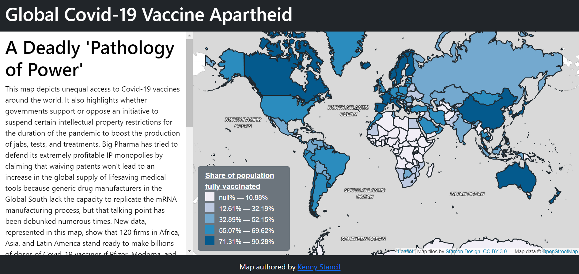
Global Covid-19 Vaccine Apartheid
This map depicts unequal access to Covid-19 vaccines around the world, highlights whether governments support or oppose an initiative to temporarily suspend intellectual property restrictions to boost the supply of lifesaving doses, and shows where untapped vaccine production potential exists.
It was generated in Leaflet using GeoJSON files containing national vaccination rates (courtesy of Our World in Data), governments' positions on the TRIPS waiver proposal under negotiation at the WTO (courtesy of Doctors Without Borders), and the locations of idle mRNA manufacturing capacity (Doctors Without Borders and the Access IBSA project).
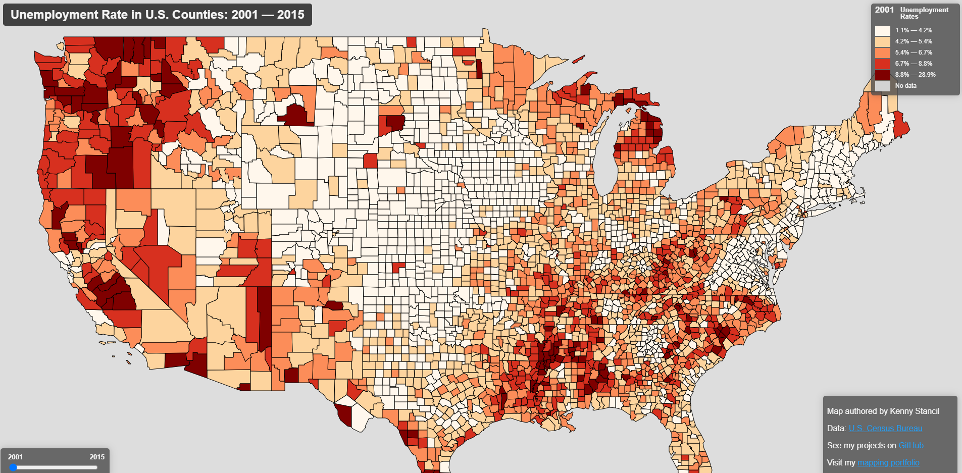
Unemployment Trends in the U.S., 2001-2015
This map shows how county-level unemployment rates across the U.S. changed from 2001 to 2015.
It was generated in Leaflet using a GeoJson file produced by joining data from the U.S. Census Bureau with U.S. county polygons.
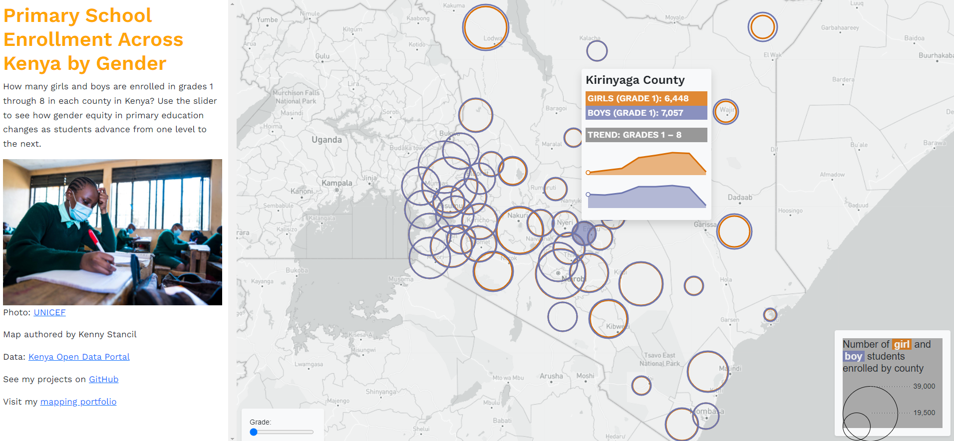
Primary School Enrollment in Kenya by Gender, 2014
This map depicts the number of girls and boys enrolled in grades 1 through 8 in each county in Kenya in 2014.
It was generated in Leaflet using information from the Kenya Open Data Portal.
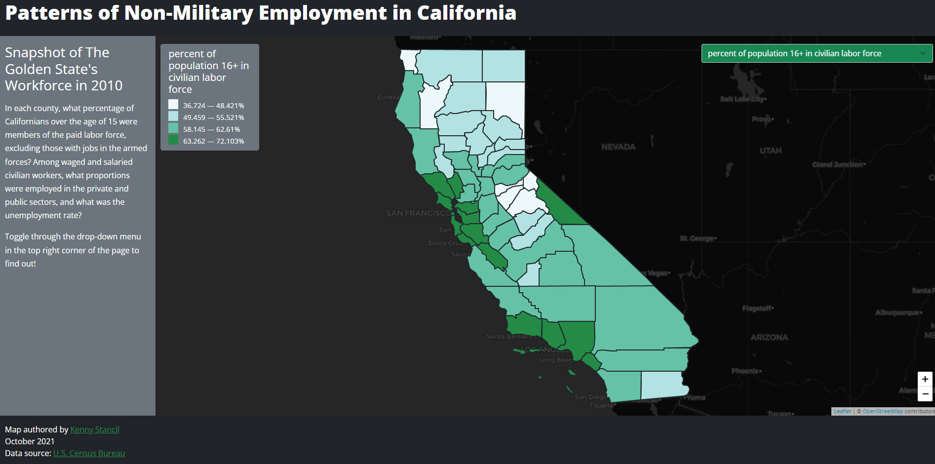
Employment Patterns in California, 2010
This map shows what percentage of civilians over the age of 15 were members of the paid labor force in each California county in 2010.
It was generated in Leaflet using a GeoJson file produced by joining data from the U.S. Census Bureau with California county polygons.
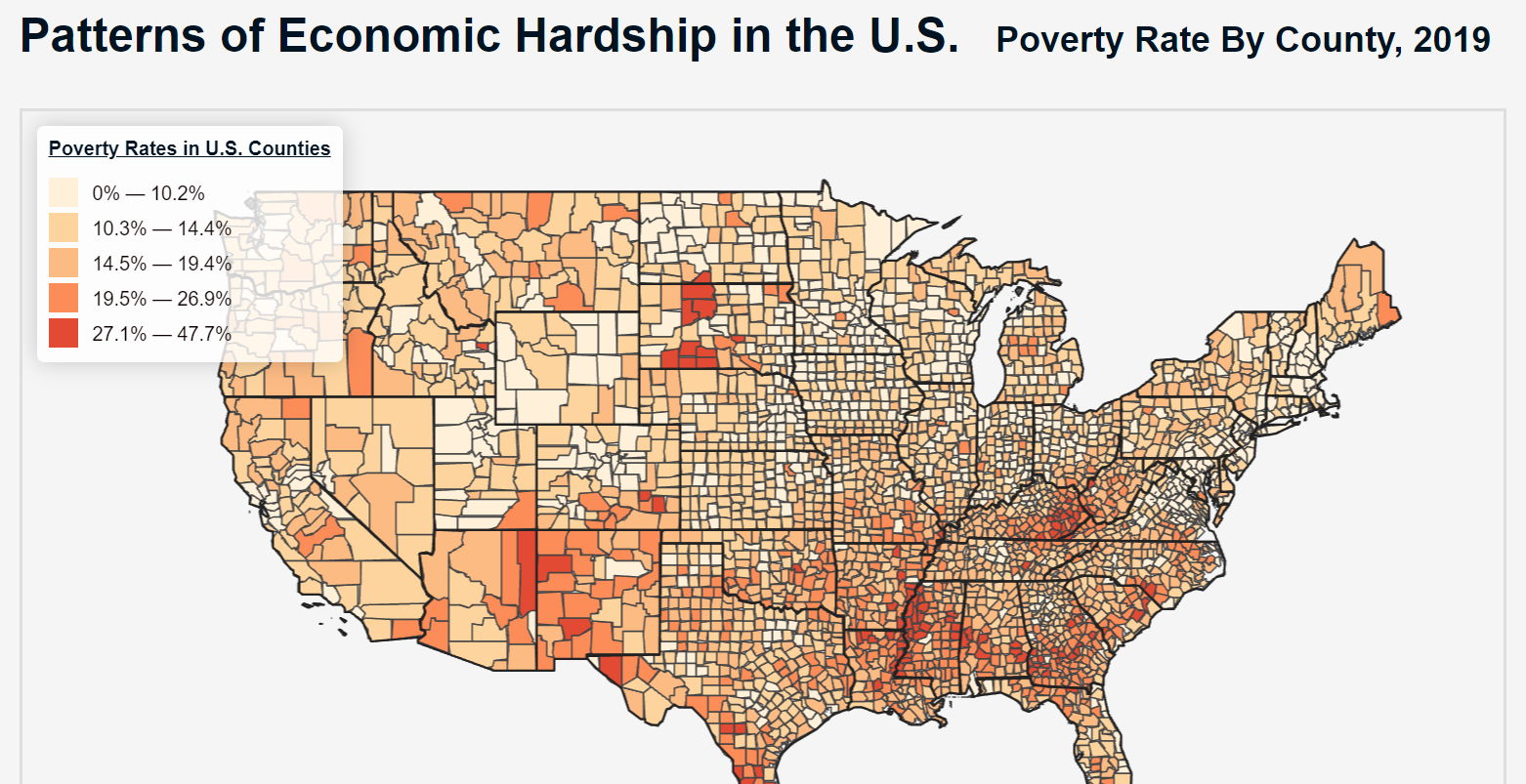
Economic Hardship in the U.S., 2019
This map documents the poverty rate in each U.S. county in 2019.
It was generated in Leaflet using a GeoJson file produced by joining data from the U.S. Census Bureau's Small Area Income and Poverty Estimates (SAIPE) Program with U.S. county polygons.
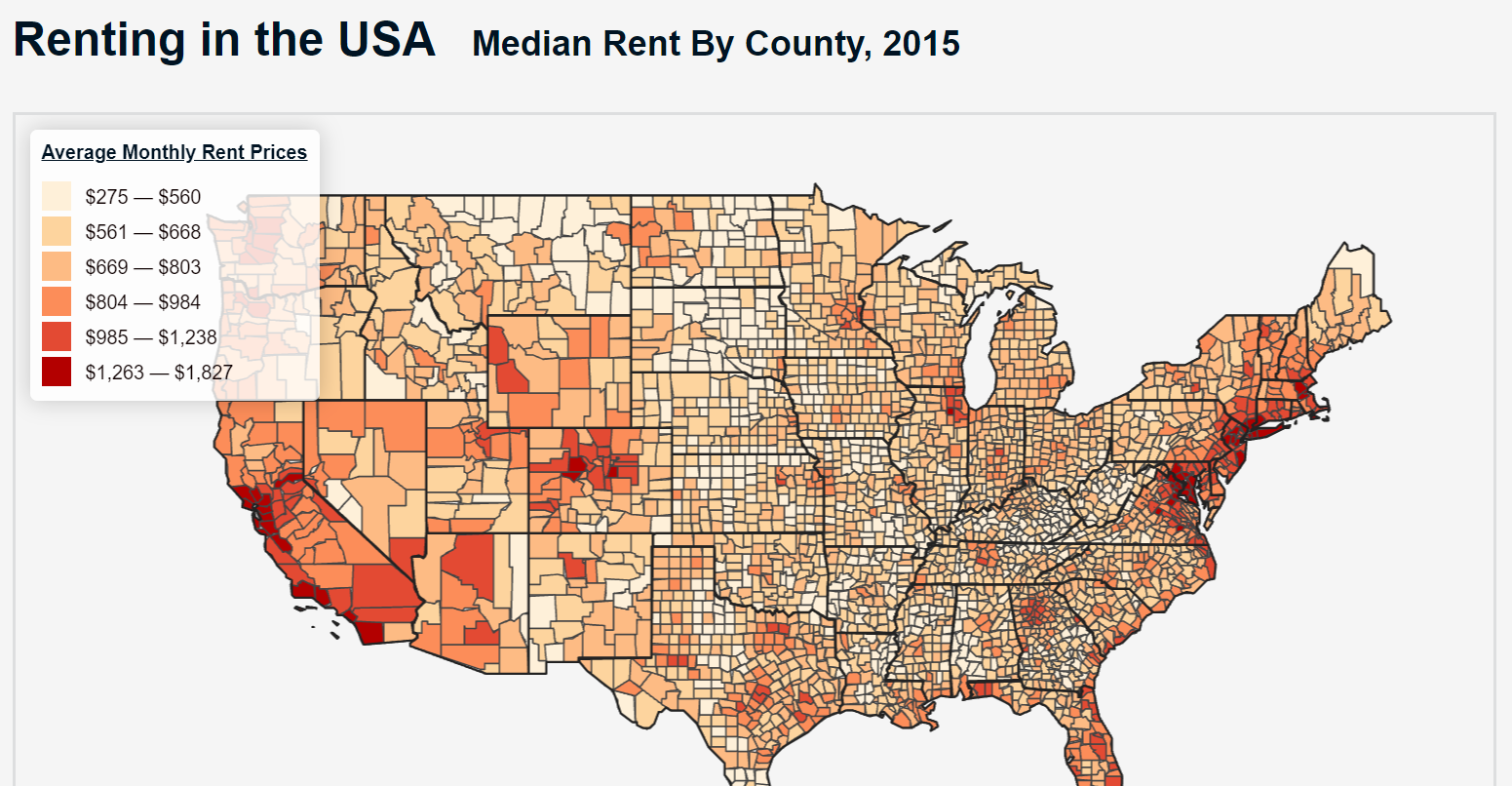
Renting in the U.S., 2015
This map shows average monthly rent prices in each U.S. county in 2015.
It was generated in Leaflet using a GeoJson file produced by joining data from the U.S. Census Bureau with U.S. county polygons.
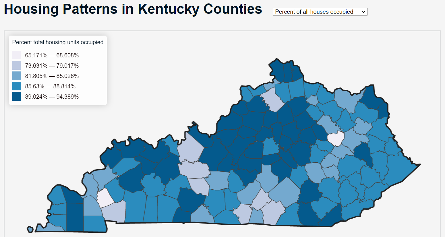
Housing Patterns in Kentucky, 2010
This map portrays a variety of housing patterns across Kentucky, including the percentage of renters, mortgagors, outright owners, and vacant units in each county in 2010.
It was generated in Leaflet using a GeoJson file produced by joining data from the U.S. Census Bureau with Kentucky county polygons.
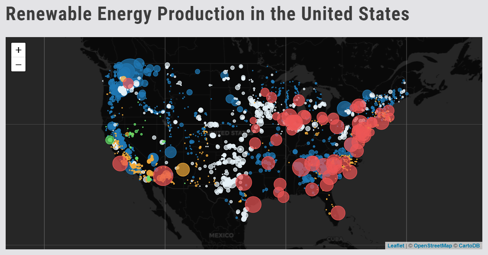
Renewable Energy Production in the U.S., 2021
This map illustrates how many megawatts of electricty were generated by solar farms, wind farms, dams, geothermal power plants, and nuclear power plants in the U.S. in 2021.
It was generated in Leaflet using data from the U.S. Energy Information Administration (EIA).